Schedule A Discovery Call
A 30 minute deep dive in your law firm's past marketing efforts, your competitors and marketing goals.
We help law firms get more qualified leads through "blended" search marketing campaigns.
GET STARTED WHAT CAN I EXPECT?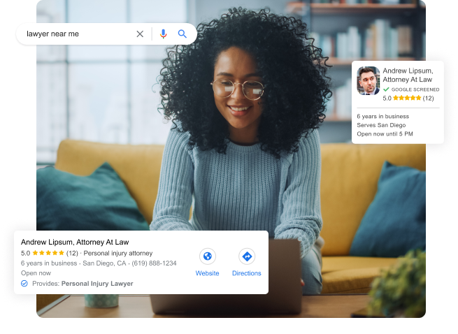
When it comes getting new cases for your law firm, there’s nothing more powerful than search engine marketing.
But…You probably already knew that. You’ve probably also invested in SEO or PPC at some point and got mediocre results (despite being promised otherwise).

Most law firms struggle because their strategy focuses on only one or two areas of search. To get meaningful results, we need to show up in EVERY SINGLE PART of Search. We deploy a “Blended” strategy targeting both paid and organic opportunities, which can effectively optimize not just to drive leads, but high value cases.
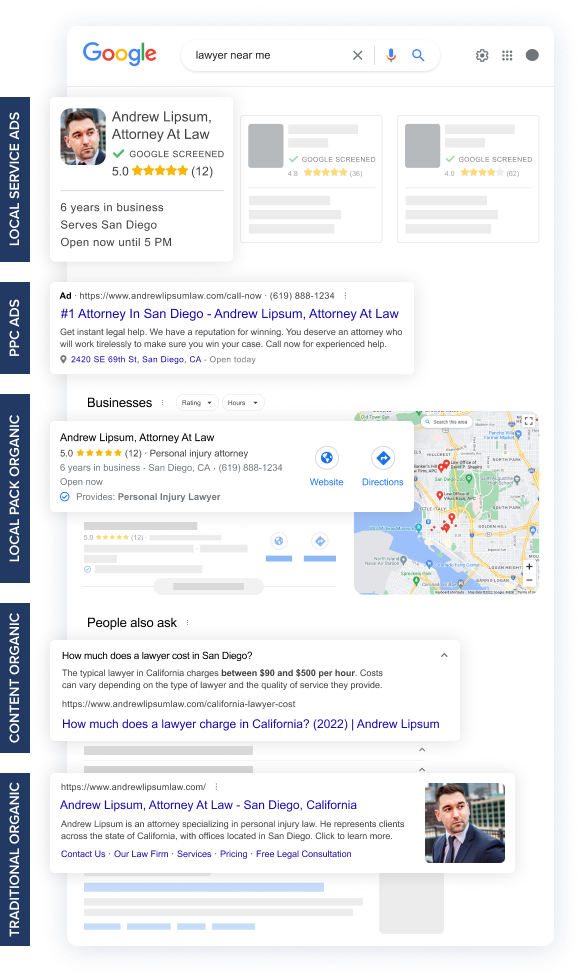
Most agencies fail to deliver results because they only focus on a few parts of the search engine result pages. Instead, we attack every single opportunity to make sure your law firm generates quality leads.
PPC ads are the fastest way to get new cases in the door. Within 14 days your phone will be ringing,
Attacking organic Google results by creating content using profitable keywords from PPC.
Localized searches ("dui lawyer near me") require a different strategy, starting with "Local Service Ads".
Securing the top ranking in Google "Maps Pack" organically for profitable PPC keywords.
Most agencies fail to deliver results because they only focus on a few parts of the search engine result pages. Instead, we attack every single opportunity to make sure your law firm generates quality leads.
GET STARTED HOW MUCH?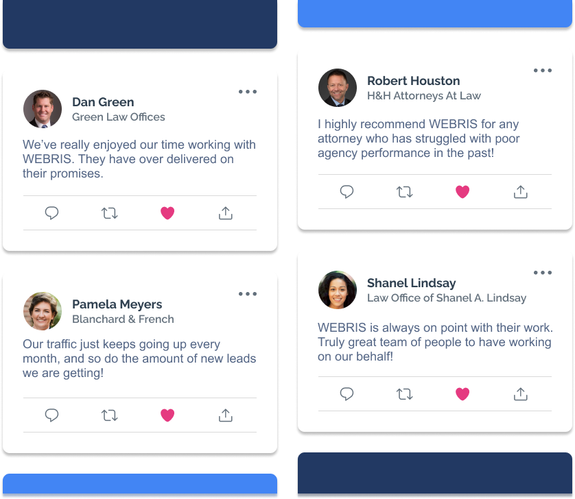
A 30 minute deep dive in your law firm's past marketing efforts, your competitors and marketing goals.
A roadmap showing you everything you need to do to start getting more leads from search engines, including investment amount and timeline to results.
If you accept our roadmap, we'll get started building your campaigns. Most of our clients start getting leads within 30 days.
GET STARTED
Campaigns Starting At
Includes:
or
Most agencies fail to deliver results because they only focus on a few parts of the search engine result pages. Instead, we attack every single opportunity to make sure your law firm generates quality leads.
First we setup a handful of paid search campaigns. The goal of these campaigns is to identify the keywords that are driving the highest quality leads, for the lowest cost.
We’re able to map those leads back to individual keywords, so we know exactly which levers to pull to scale.
We take those winning keywords and build new content on your website to start the organic ranking process.
We continue the process of finding new keywords, scaling and pushing to organic.
The goal is to build an engine that finds the most valuable keywords.
The final step is optimizing for hyper local searches (near me).
This is a process of optimizing GBP profiles, soliciting reviews and securing local citations.
Everything is meticulously tracking in a lead tracking dashboard.
Our consultants setup call tracking, form tracking and website engagement tracking so we can clearly show you your leads, traffic and rankings.

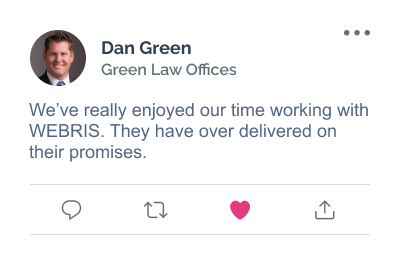
“We saw an instant increase in leads coming from our website after working with Webris, with a steady stream of quality cases pouring in month over month!”

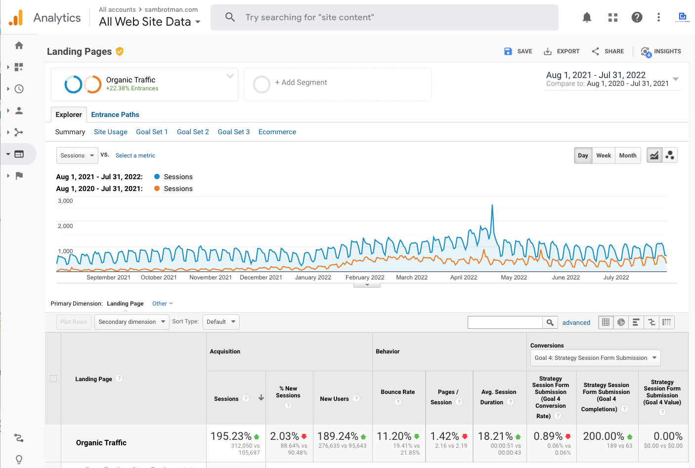

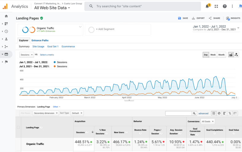
A new website with improved SEO structure paired with an aggressive content creation campaign, Brotman Law's case requests increased by 2x.
A lead generation strategy has been proven to work for all law firms, no matter where you're located or what you practice. It's been proven time and time again to help all law firms get new cases in the door.
As a busy attorney, we know what you care about - qualified new cases. Not rankings, not traffic, not leads...QUALIFIED cases. Everything we do is focused on optimizing your campaigns to generate new business, not waste your time with tire kickers.
The only way to win is to be the best, which is why we invest so heavily into executing the work perfectly.
You're busy, so we handle everything for you. We keep you integrated and briefed, but we happily handle the heavy lifting.
We are always on stand by for our clients. Our consultants hold regular status calls to review progress and review results.
We’re genuine experts with a ton of experience and a serious track record for success. We practice what we preach and we’re really good at it.
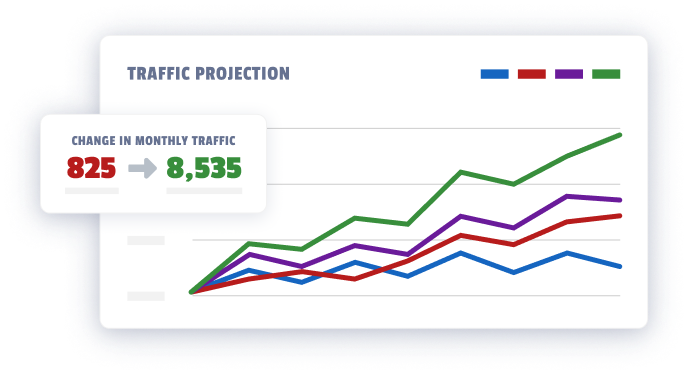
We can show you exactly what your website’s revenue potential is. Our analysts built a report that uses your data to construct accurate forecasts for how much traffic and leads you’re missing out on.
Most agencies are not fit to service law firms. Their strategies are out touch and they don’t understand the inner workings of your business.
I’ve worked with law firms for almost a decade, I know what you care about.
Not rankings, not traffic, not colorful charts and not even leads. New client cases.
Our entire process is built with that goal in mind, which is why we’re so damn effective at what we do.
From the way we operate to the way we structure our contracts, we’re not here to bill you for busy work, we’re here to help you land big cases.